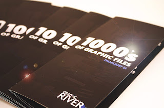
A brochure is a small print of information about a company which usually
people print for the tourist, clients and visitors. This is also given to those who visits meeting or conferences. There are
many kinds of Brochures. It can be single page, Bi-folded and tri-folded. Also sometimes
it is Z-Folded and C-folded.
This is the best way to inform your customers about your
current packages and services.
For Brochure Design you need to be very careful, because
this is a way to get customers. Following points must consider when designing
brochure.
Concept and Idea:
The basic of every design starts from your concept. If your
concept fails your overall project would fail. Determine that how this brochure
is going to use by the people? What is the purpose of your project? And how
your customers are going to get it?
Theme Selection:
Based on your concept, design a best possible theme. The
theme colours and design helps a lot to get people attraction. Design a theme
that matches your brochure purpose.
Know the targeted audience. If the audience
is youth, use sharp and bright colors. Same as, if your company is specific for
older business men. You need to choose elegant themes.
Creativity:
All Your success depends on your creativity. So be creative
and give your best effort. You can inspire the customers by your creativity. Do
something that has never happened before.
Title:
Make the title eye catchy. A Huge icon of your company is a way to make your identity. Use large bold fonts on the title.
Headings:
Bold Headings with bullet pointing to that heading is necessary to tell your customer the most important points. Use them in a creative manner. You can also circle something that is far more important.
Fonts:
Do not use such fonts
that are not easily readable. Too Big or
too small font can create mess. Make your brochure font readable for your
customer. Font colors should not mixed up with the background.
Pictures:
Use Small or large pictures to create the brochure easily understandable. You can also use small icons to present the specific information. If you are using background pictures, use them in light shades. Dark shades in background simply disturb your font.
Print Size:
This is necessary to know the print size of your document.
As you need to manage cost also. This is important so keep things in budget.
Know first how much is your requirement. Know that whether you need single, Bi-folded
or tri-folded Brochure.
Print Resolution:
Last step is of course printing. So use high resolution in prints. Fine prints are more eyes
catchy, while dull and blasted pixels ruin the impression.
Use High Quality papers.

0 comments:
Post a Comment